The process behind a logo, from audit to handover
The five stages of a logo project as we run them: audit, constraints, sketch and reduction, testing at real size, and a documented file matrix. The handover document is the deliverable, not the drawing.

Contents
Updated 6 November 2024 — added the WCAG 2.2 target size rule, the European Accessibility Act date, and dark-mode icon variants to the file matrix.
A logo project runs in five stages: audit what already exists, convert positioning into drawing constraints, sketch and then reduce, test at real size and in real context, and produce color and one-color variants inside a documented file matrix. The handover document is the deliverable. The drawing is one file inside it.
Key takeaways
- The audit starts with reproduction, not taste: every surface the current mark appears on, and every place it already fails.
- Constraints are written before sketching — minimum size, one-color requirement, the confusion set, and the contexts nobody in the studio controls.
- Vector masters go out as SVG, a W3C Recommendation since 16 August 2011, with fixed-pixel raster exports beside them (W3C).
- WCAG 2.1 exempts the logotype from the 3:1 non-text contrast rule, so the guidance has to cover the interface around it (W3C).
Audit first, and what the audit produces
Collect every existing application before opening a drawing tool: signage photographed on site, packaging, invoices, the favicon, the social avatar, vehicle graphics, uniform embroidery. The inventory is usually longer than the client expects and contains three or four unauthorized redraws.

Then check the register, searching the category for marks with the same figurative structure.
WIPO's Vienna Classification organizes the figurative elements of trademarks into 29 categories that run from the general to the particular. Around 60 offices, including the EUIPO, code registered marks with it, which makes it a usable shortlist tool when checking a new mark against a category. Source: WIPO.
The output is a one-page constraint sheet: minimum reproduction size in millimeters and pixels, required reproduction methods, the confusion set by name, and the applications to redraw on day one. It answers the questions a good brief should have asked and sets the scope you quote against.
Sketch, then reduce
Volume first: dozens of thumbnails at 20 mm, in pencil or in flat vector, no color. Small drawing forces structural decisions and hides the detail that later fails.
Reduction is the second pass and the one that matters. Remove a stroke; if the mark still reads, it was decoration. Repeat until removing anything breaks recognition. A mark someone can redraw from memory after ten seconds has passed a test no presentation substitutes, and it is the compression job the mark exists to do.
Testing at size and in context
Rasterize to 16 pixels square and look at the bitmap, not the vector. Print at the real minimum size on the client's actual substrate. Place the mark in a header, in a marketplace listing, and against the five competitor marks it will sit beside.
Placement is part of the test, not a later layout decision. The lockup has to work in the position users expect it in.
Nielsen Norman Group tested 128 participants on hotel websites with the logo top-left or top-right. Average brand recall was 39% for left placement and 21% for right, and the unconventional position did not make brands appear more distinctive. Source: Nielsen Norman Group, 21 February 2016.
Color, one color and the file matrix
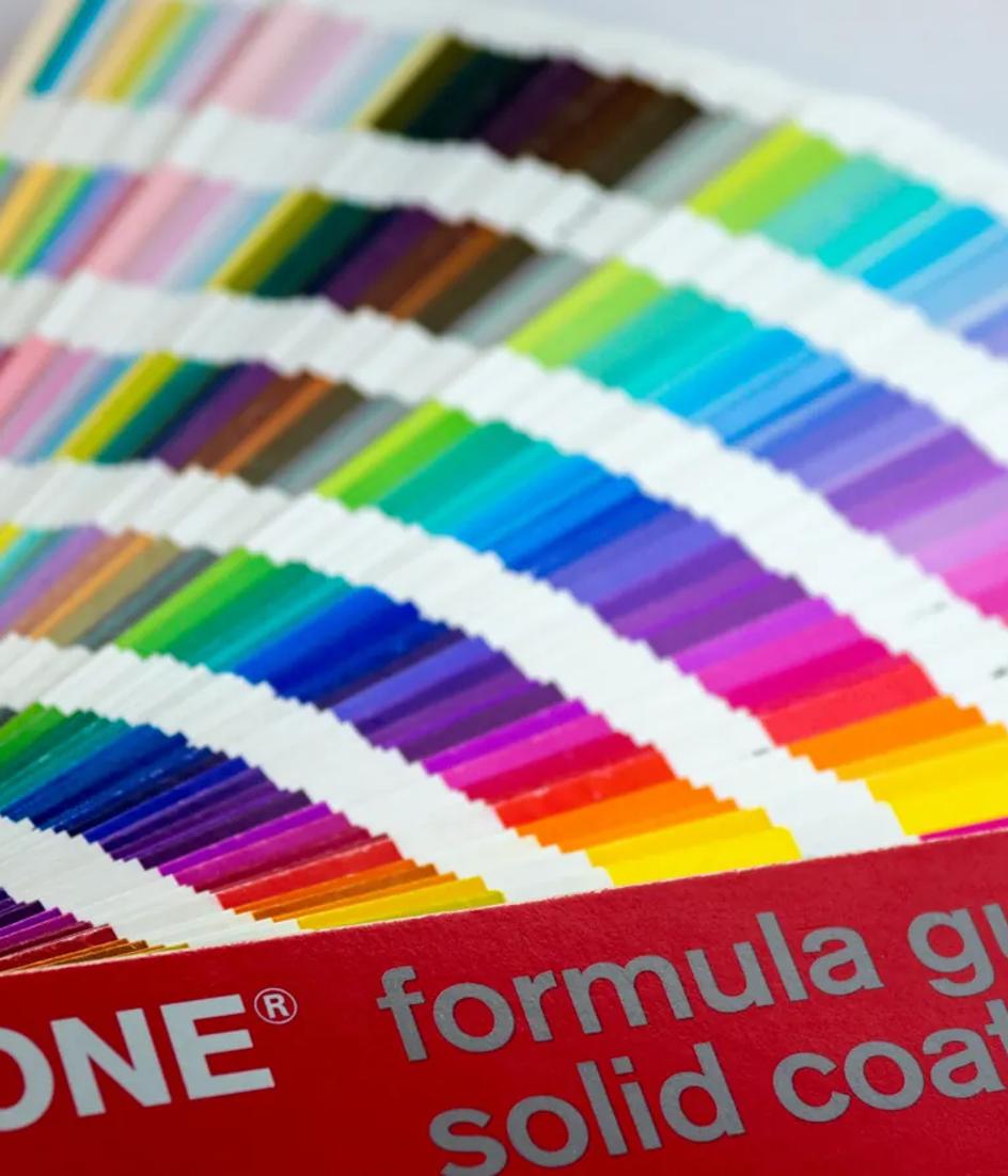
Specify color by space, never as one hex value carried everywhere. Screen values go in sRGB, standardized as IEC 61966-2-1:1999; print gets its own values, checked on the client's stock rather than converted automatically.

The matrix that ships is short: SVG masters per variant, PNG exports at the pixel sizes the client actually uses, a print-ready vector format, a favicon set, a square avatar crop, plus one-color and reversed versions of everything. SVG usually costs less to serve than the equivalent raster, which matters where loading behavior is being measured.
What goes into the handover
The document is the deliverable. It states clear space as a ratio of a feature of the mark rather than a fixed millimeter value, the minimum sizes by medium, the misuse cases as images, the color values per space, and a naming convention that survives a shared drive.
It also covers the interface around the mark. Logotypes are exempt from the 3:1 non-text contrast rule; the header, buttons and icons beside them are not. In the EU, EN 301 549 V3.2.1, published in March 2021, points public-sector web content at WCAG 2.1 Level AA. Specifying this at handover avoids the argument later, for the same reason we quote scope rather than hours.
What changed in this update
Two things moved since 2021. WCAG 2.2 became a W3C Recommendation on 5 October 2023 and added SC 2.5.8, Target Size (Minimum), Level AA: pointer targets of at least 24 by 24 CSS pixels unless spacing or another exception applies. A logo used as the home link is one of those targets. And Directive (EU) 2019/882, the European Accessibility Act, requires Member States to apply its measures from 28 June 2025, with e-commerce in scope.
So the file matrix now ships a dark-variant icon too. Browsers have supported `prefers-color-scheme` since 2019, and that icon pair belongs beside the tokens that carry color into code and the wider screen brand system.
FAQ
How long does a logo project take?
Plan in stages, not weeks. Audit and constraints usually take longer than clients expect because the inventory has to be collected from the field. Sketch and reduction are fast. Testing and documentation are where projects slip, because that is where undefined applications surface.
What file formats should a client receive?
SVG masters for every variant, PNG at the specific pixel sizes in use, a print-ready vector file, a favicon set and a square avatar. Each of those in full color, one color and reversed. Anything else is a derivative the client can generate from the masters.
Do we need a trademark search before designing?
Do a structural check early, then a formal search before the mark is finalized. Coding the sketch against the Vienna Classification categories used in the category shows conflicts while changing direction is still cheap. Formal clearance is legal work and belongs with a professional.
What to do next
Run the audit before agreeing a price, because the inventory determines the real scope. Write the constraint sheet, get it signed, and treat reduction as the point of the project rather than a cleanup step. Keep the applications catalogued, so in six months you can see which surfaces drifted and whether the documentation was specific enough to prevent it.