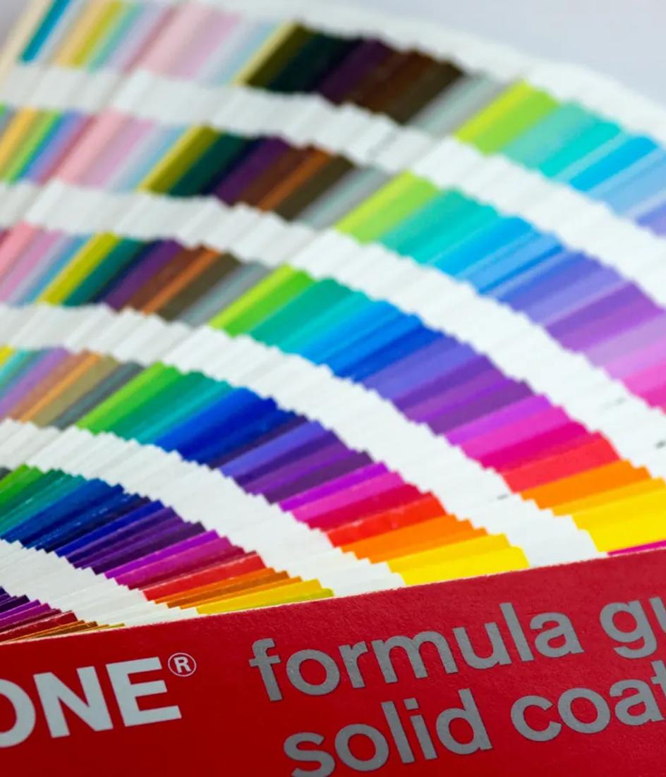
How to build a brand system that holds on screen
Type scales that survive a 320-pixel viewport, a color system defined as contrast pairs rather than swatches, dark mode as a designed state, and the WCAG ratios that constrain the palette before anyone picks a color.

Contents
- Key takeaways
- What holding on screen actually means
- A type scale that works at 320 CSS pixels
- Type that survives resizing and respacing
- Color as pairs, not swatches
- The contrast ratios that constrain the palette
- Non-text contrast for icons, borders and states
- Dark mode is a designed state, not an inversion
- What the European Accessibility Act adds
- Governance: tokens, documentation and review
- FAQ
- What to do next
A brand system holds on screen when the type scale still reads at a 320-pixel viewport, when every color is specified as a pair with a measured contrast ratio, and when dark mode is designed rather than inverted. WCAG sets the floor: 4.5:1 for body text, 3:1 for large text and interface graphics.
Key takeaways
- WCAG Success Criterion 1.4.3 requires at least 4.5:1 for text and 3:1 for large text, defined as 18 point or 14 point bold — roughly 24 px and 18.5 px (W3C).
- Success Criterion 1.4.10 Reflow, Level AA, requires content to work at a width equivalent to 320 CSS pixels without two-dimensional scrolling (W3C).
- Success Criterion 1.4.11 sets 3:1 for interface components and meaningful graphics, and exempts logotypes (W3C).
- Directive (EU) 2019/882 requires Member States to apply its accessibility measures from 28 June 2025, with e-commerce services in scope (EUR-Lex).
- Dark mode adoption is still thin: the 2022 Web Almanac found
prefers-color-schemeon 8% of pages, against 34% forprefers-reduced-motion(HTTP Archive, 26 September 2022).
What holding on screen actually means
Print identity fails on screen for a specific reason: the medium refuses to hold still. The reader can zoom to 400%, override the font size, force a text-spacing stylesheet, switch to a dark theme, or arrive on a 320-pixel viewport. None is an edge case, and all are covered by published success criteria.
So a screen brand system is not a set of screenshots. It is a set of rules that survive the reader changing the conditions: a type scale in relative units, color specified in pairs, spacing on a fixed rhythm, and a documented behavior for each user preference the platform exposes.
That reframes what the guidelines are. WCAG 2.2, a W3C Recommendation since 5 October 2023, is not a compliance annex bolted onto the design. It is the constraint sheet the design has to be drawn against, in the same way a logo is drawn against its smallest reproduction.
A type scale that works at 320 CSS pixels
Reflow, Success Criterion 1.4.10, is what most brand systems fail first. It requires content presented without loss of information or functionality and without two-dimensional scrolling at a width equivalent to 320 CSS pixels — which the W3C notes is a 1,280-pixel viewport at 400% zoom.
WCAG Success Criterion 1.4.10 Reflow, Level AA, requires content to work without scrolling in two dimensions at a width equivalent to 320 CSS pixels for vertical scrolling content, and 256 CSS pixels for horizontal. That is equivalent to a 1,280-pixel viewport zoomed to 400%. Source: W3C Web Accessibility Initiative.
Practically, that kills three habits. Display type set in fixed pixels for a 1,440-pixel canvas, which overflows. Tables and cards with minimum widths larger than the viewport. And headline tracking tuned at large sizes that closes into an unreadable block when the value scales down.
Build the scale with a small ratio and a defined minimum and maximum per step, so display sizes compress faster than body text as the viewport narrows. Body text should not be what shrinks; it is already at the bottom of the scale.
Type that survives resizing and respacing
Two more criteria constrain typography. Success Criterion 1.4.4 requires text to resize up to 200% without assistive technology and without loss of content or functionality. Success Criterion 1.4.12, Text Spacing, requires no loss of content when a reader sets line height to 1.5 times the font size, paragraph spacing to 2 times, letter spacing to 0.12 and word spacing to 0.16.

Both test the container, not the typeface. Fixed-height buttons, single-line navigation items and cards with clipped overflow are what break. Design components to grow vertically by default and the two criteria mostly take care of themselves.
Variable fonts help more than they are usually credited for. OpenType font variations, announced in September 2016 by Google, Microsoft, Apple and Adobe as part of OpenType 1.8, let one file carry a continuous weight and width range, so a system holds optical adjustments across sizes without shipping eight static files.
The 2022 Web Almanac found pixels still dominate: 71% of pages used px for font-size, against 15% for em and 6% for rem. A brand system that specifies its scale in relative units is doing something most sites still do not.
Color as pairs, not swatches
A brand palette listed as ten swatches is not a system, because a color has no contrast on its own. The unit of a screen color system is the pair: foreground on background, with the measured ratio recorded next to it.
Write the palette as a matrix of allowed pairings, marking failing combinations as forbidden rather than leaving them undefined. Every pair carries a role — body text, secondary text, disabled state, focus ring, border, icon — and a ratio. Anything outside the matrix is not a brand color combination.
Specify base values in sRGB, standardized as IEC 61966-2-1:1999, since that is what a browser assumes for untagged content. Wider-gamut variants layer on top, but the sRGB pair is the one that has to pass.
The 2022 Web Almanac reported that six-digit hexadecimal notation still accounted for 49% of color declarations, withhsl(),lab()andlch()each below 1% despite broad browser support. Source: HTTP Archive Web Almanac, CSS chapter, 26 September 2022.
The contrast ratios that constrain the palette
Success Criterion 1.4.3 sets 4.5:1 for text and images of text, with 3:1 permitted for large text. Large is defined as at least 18 point, or 14 point bold; the W3C notes that at 1pt = 1.333px this is approximately 24 px and 18.5 px.
Two consequences for brand color. First, a mid-tone brand color rarely passes 4.5:1 against both white and its own tint, so most identities need a darker text variant of the primary color that is not the primary color. Second, the 3:1 allowance for large text is what makes a brand color usable in headlines, which is where it should be doing its work anyway.
Logotypes are exempt from 1.4.3, and from 1.4.11. That exemption is narrow and it is not a license: it covers the mark shown in the brand's own colors, not the interface built around it. The handover documentation is where that distinction has to be written down, because nobody rediscovers it during a sprint.
Non-text contrast for icons, borders and states
Success Criterion 1.4.11 requires 3:1 against adjacent colors for two things: visual information needed to identify user interface components and their states, and parts of graphics required to understand the content.

That covers what palettes usually ignore — input borders, focus indicators, toggle states, chart series, icon strokes and the boundary of a card. A light-gray 1-pixel border on white is the most common failure, usually inherited from a print palette where the same gray was texture rather than a functional edge.
WCAG 2.2 also added Success Criterion 2.5.8, Target Size (Minimum), Level AA, which requires pointer targets of at least 24 by 24 CSS pixels unless spacing or another exception applies. Icon size is therefore a brand decision with a floor, not a purely visual one.
Dark mode is a designed state, not an inversion
Inverting a light theme produces two predictable failures: brand colors that passed 4.5:1 on white fail on near-black, and pure white text on pure black produces halation that makes body copy harder to read at length.
Design dark as its own state: desaturate and lighten the brand hue for foreground use, replace shadows with surface elevation expressed as lighter background steps, and set the darkest surface a little above pure black. Every pair gets a dark counterpart with its own measured ratio.
Platform support is old enough to be uncontroversial. WebKit shipped `prefers-color-scheme` and the color-scheme property in 2019, and its guidance is explicit that filters across broad content sections cost memory and performance, and that styling colors directly is the accurate approach.
Adoption is another matter. prefers-color-scheme appeared on 8% of pages in the 2022 Web Almanac. Treat a dark theme as a scope decision with its own cost, not a checkbox.
What the European Accessibility Act adds
Until recently, these were quality arguments. Directive (EU) 2019/882 makes them procurement arguments in the European Union. Member States had to adopt the measures by 28 December 2022 and apply them from 28 June 2025, and the scope covers e-commerce services alongside banking, transport, e-books and consumer terminals.
Directive (EU) 2019/882, the European Accessibility Act, was adopted on 17 April 2019. Article 31 requires Member States to adopt implementing measures by 28 December 2022 and to apply them from 28 June 2025. E-commerce services are within scope. Source: EUR-Lex.
The technical reference in Europe is EN 301 549, whose V3.2.1 of March 2021 reflects WCAG 2.1. The practical effect is that the contrast matrix and the type scale become deliverables a client's legal team may ask to see, which changes how work gets scoped for the Spanish market.
Governance: tokens, documentation and review
None of this survives without a mechanism. Color pairs, type steps and spacing values ship as design tokens rather than as a PDF, because a token is the only form a developer cannot approximate by eye.
The documentation states three things per decision: the value, the role it is allowed in, and the measured ratio or size it satisfies. Add the same treatment for motion, which has its own criteria, and the system covers every user preference the platform currently exposes.
Then set a review cycle. Contrast regressions arrive through component changes, not palette changes, so the check belongs in the build. A system nobody verifies decays at roughly the rate the product ships.
FAQ
What contrast ratio does brand text need?
At least 4.5:1 against its background for body text, and at least 3:1 for large text, which WCAG defines as 18 point or 14 point bold — approximately 24 px and 18.5 px. Ratios are thresholds, so a value just below the number does not meet the criterion.
Is our logo exempt from contrast requirements?
The logotype itself is exempt under both 1.4.3 and 1.4.11 when it appears in the brand's own colors. Nothing around it is exempt: the header background, the navigation text, the icons, the borders and the focus indicator all have to meet their applicable ratio.
Why 320 CSS pixels rather than a common phone width?
Because Success Criterion 1.4.10 Reflow defines it that way, and because 320 CSS pixels is what a 1,280-pixel viewport becomes at 400% zoom. Designing to that width covers both small screens and readers who magnify the page: different users with the same layout requirement.
Do we need a dark theme?
Only if you will maintain it. A dark theme doubles the contrast matrix and every component review. The 2022 Web Almanac found prefers-color-scheme on 8% of pages, so it is a deliberate investment rather than a default expectation — but if you ship one, design it rather than invert.
Where do variable fonts fit in a brand system?
They let one file carry a continuous weight and width range, which keeps optical adjustments consistent across a scale without shipping many static files. That matters most for systems with wide size ranges, where a single static weight looks too light in display sizes and too heavy in captions.
What to do next
Start with the constraint sheet, not the palette: the contrast matrix, the type scale with minimum and maximum steps, and the reflow behavior at 320 CSS pixels. Ship those as tokens and put the contrast check in the build. Then decide deliberately whether a dark theme is in scope, and if it is, design it as its own state with measured pairs. In six months the useful measure is not whether the system looks consistent in a presentation, but how many exceptions were requested and how many components drifted out of the matrix unnoticed.